TOKYO BOOM
TOKYO BOOM
This charming restaurant and event space in the 7th viennese district allows visitors to dive into a lovingly handcrafted world of colourful, joyful Tokyo vibes. The owners as well as the team are a vibrant bunch, working on this project with passion.
SUMMARY
They have been offering not only unique vegan japanese street food, but hosting various activities and queer community events as well.
I had the joy of redesigning their visual identity and mascot and creating various illustrations, graphics and layouts for them.
BRANDING / VISUAL IDENTITY
To communicate the lively spirit of Tokyo Boom, I took a deep look at all of their existing material. Based on their existing style direction, their wishes and my knowledge, I created an updated style concept including a new colour palette, recommended fonts and illustration style. I analysed their pre-existing logo and had permission to keep what works and toss what doesn’t.
So I made the update, changing colours and symbols while keeping the font. Sparkles accompany the bold pink letters. Most importantly though, based on an illustration they had been using previously, I created their new mascot – the ballet-dancing sumo. (More on this in the next section.)
ILLUSTRATIONS & ICONS
Keeping the style / color guidelines, I created a wide catalogue of fun, cute and vibrant food, item, ornamental and background illustrations. They were used in various places, from the menu to instagram story stickers to stickers, pins and charms.
The new illustration style had to fulfil a few requirements – the food illustrations had to be clear and clean so that the dishes could be easily recognised and understood by the customers when viewed in the menu, and, of course, they needed to look tasty.
MASCOT
The centre piece of the entire visual branding must be the mascot: ballet sumo. This little guy embodies the queer, fun-loving spirit of Tokyo Boom, dancing and smiling through all of their marketing material and on-location designs. Despite obviously showing a lot of skin, the sumo gets an innocent touch through his soft, simple shapes and friendly expression.
For various uses, I created a collection of “sumojis” (sumo emojis) that are dressed up for different occasions or seasons or express different messages. Where ever the sumo shows up, he is surrounded by sparkles, for he is here to appeal to and greet all those who love rainbows and glitter as much as he does.
MARKETING MATERIAL
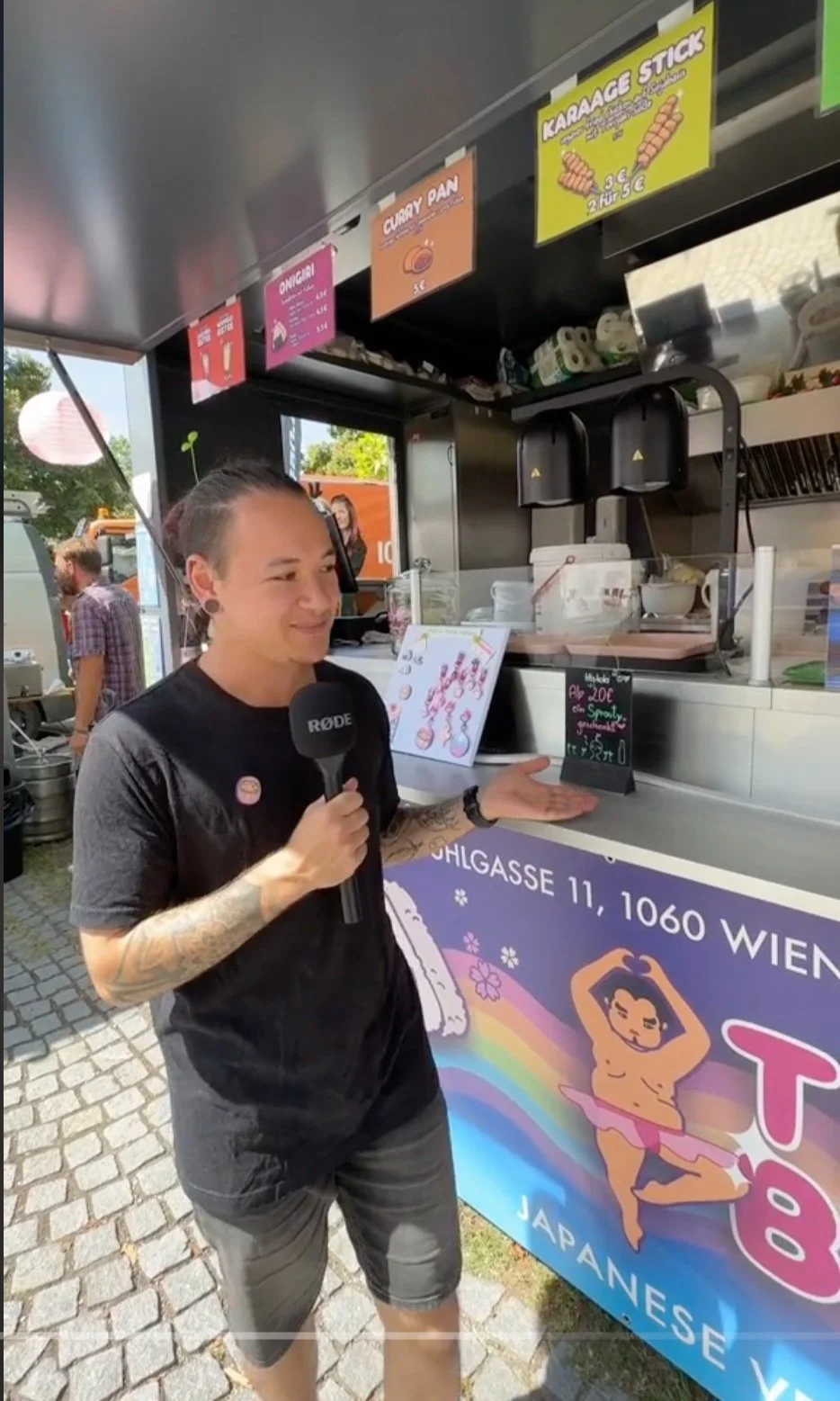
To increase the visibility of Tokyo Boom, various marketing materials had to be created. Their participation in food conventions such as the Veganmania contributed to them attracting new clients. For their booth, I designed a hanging banner and single-item menu cards.
The standing banner was also created for convention use, however it now also attracts more passerby’s outside the restaurants own location. To treat their customers, gift cards for a free drink as well as stickers were added.
As Tokyo Boom is a place centred around their delicious japanese food, the menu design was of high importance. Aside from the regular menu, this also included seasonal menus that would call for fun color concepts, special illustrations for seasonal items and ornaments to support the seasonal feel.
MENU
To make the menu easy to understand, the food illustrations are front and center, large enough for customers to take a close look at dished they may habe not heard of previously. To make pages easily replaceable with menu changes, pink glossy clipboards were used.


